What if you don’t already know what you’re looking for?
Project: Off the map (curiosity-driven navigation)
Challenge: Cartographic, path-based maps answer the question, “is there a road there?” but can’t answer more important questions about travel planning- “where can I get from here?” and “what is it like there?" even though they underpin most modern mobility interfaces. What if (these) maps got space and time all wrong?
Method: Ethnographic survey, prototype testing, in-field observation, UX design
Result: Language and UX for open-ended travel and trip planning
Duration: 28 weeks
Imagination is a crucial component of navigation.
How do we see the world?
Our eyes take in a picture, and memory goes to work relating pieces of what we saw to things we already know, like an if-this-then-that machine.
Then imagination uses those same relationships to predict what might come next, literally extending the image we remember past the edges of what we actually saw, as demonstrated in a landmark 2009 study by Drs. Sinead Mullally and Eleanor Maguire.
That is the process of curiosity- it’s the way we naturally perceive the world- but the maps we use don’t let us work this way.
Three tools to support curiosity: multivariate search, point-of-interest clustering and temporal (time-based instead of cartesian) mapping.
This pen+paper prototype maps neighborhoods in time instead of space, so that every place in San Diego is as far away from the center (and each other) as it looks, and it plots points of interest, instead of roads and paths, based on a participant’s chosen inputs for a Saturday morning excursion.
It allows the reader to plan an open-ended trip, at a glance, using multivariate search and clustering points-of-interest on a map of travel time.
Triangulation visualizes travel time throughout the day with minimal error (<5% per 30 minutes of travel).
This is Northeast Los Angeles- in minutes not in miles- throughout the day. See that point that falls off the edge of the Earth on the right at 5PM? That’s Azusa. At rush hour, you can’t get there from here in a reasonable amount of time. It doesn’t really exist, does it?
A time-based mapping system always shows you the world you can actually get to, making sense of the data it is used to visualize, like point-of-interest clusters that explain what it is like there.
Trip planning and decision-making tools that support curiosity empower travelers to act spontaneously.
Cartographic maps force travelers to make mental transformations (from space to time) and conduct additional research (about points of interest.)
You’ve probably never been to Ottawa, but if you found yourself at the Bayview train station in the middle of the map on the right, you’d know exactly where to go next.
A generation of delayed drivers are an opportunity to humanize navigation.
For the first time in decades, the majority of US 16-19 year olds don’t have a driver’s license. Young travelers want to want to drive, but free time has high stakes, and their digital experiences need to work the way they do.
A generational push to build infrastructure needs a language of possibilities.
In Los Angeles, $200 billion over 50 years will build new roads and rails. Maps of potential projects miss the key point that will change citizens’ lives- where will they be able to go, that they couldn’t get to before? What is it like there?
What if (autonomous) cars could communicate on human terms?
Trust issues with AVs stem from a perceived lack of control. So, what does it really mean to be in control, and how can this drive the design of better ‘driver’ interactions?

We asked some humans to find out.
Project: E//motive (contextual interaction UI)
Challenge: How could vehicle information interfaces and control inputs give riders enough context to take control of an automated ride experience?
Method: Card-sorting study to determine information groupings, mock-up testing to determine content layout and interactions
Result: Human-centered vehicle dynamics interface modules
Team: Yihao Duan and Jamie Goldstein
Role: Research planning and lead, project brief and ideation framework, testing documentation and synthesis, prototype design/fabrication
Duration: 14 weeks
Card-sorting interaction groupings
A simple card-sorting activity asked people to pick pieces of information they would want a self-driving car to communicate, and group them into useful categories.
Full-scale placement mockup
Movable ‘displays’, printed graphics, and a full-scale seating buck invited people to put the information they wanted to see, where they wanted to interact with it.
Final walkthrough and renderings
A basic simulator, UX walkthrough and renderings demonstrated the final interior layout and interface developed from this research.

I’d like to tell you a story about love, life, and magic.
Project: Abracadabra (for Renault)
Challenge: In an age of technological shock-and-awe, how do you create moments of surprise-and-delight inside autonomous cars?
Method: Visual storytelling
Result: Magic interaction story
Team: Wending Li
Role: Project strategy, conceptual framework, storyline and visuals.
Duration: 3 weeks
A surprise is unexpected, but magic is unexplained.
The magic of the in-car experience isn’t just the use of gaze and emotion detection to create an augmented reality gaming experience with roles that suit the occupants’ moods.
In the end, its a time machine, and so much more.
It’s in the use of this technology to recreate what made human-driven cars such unique environments- maintaining just the right level of cognitive distraction and forward-focus of the occupants to make space for an important conversation, and maybe taking the long way home to keep the magic going.
In dense urban areas, limited curb space leaves no room for guesswork. How can the context of a city block dictate the capacity of its mobility options?

Start by counting the elevators.
Project: Shift trial performance criteria (aiPod / Innovate UK / Transport for London)
Challenge: In busy London boroughs, there is little room for wasted space. How do you figure out what a mobility-as-a-service trial can and should do, and where it could fit?
Method: Quantitative data analysis, presentation design, business development
Result: Performance criteria for a real-world urban MaaS trial program
Duration: 16 weeks
Line analysis of travel possibilities
A plurality of Londoners take transit, and transfers are not very common, so a simple line analysis shows where a lot of people go, and where they can’t.
Neighborhood typologies of selected boroughs
A close look at selected boroughs shows how the neighborhoods differ, while a closer look at city blocks and travel modes shows how a new service mode could fit into existing gaps.
Would you like to come on an adventure?
Planned discomfort is a key element of some of our most treasured experiences. What will this be like in the context of an autonomous vehicle?

What do urban explorers and off-road adventurers have in common?
Project: Cliff
Team: Andres Felipe Alvarez Barbosa, Wending Li and Anshul Malhan
Role: Research, project brief, strategy and ideation frameworks, prototype planning/design and CAD for final renderings
Duration: 28 weeks
Challenge: Urban explorers leave their comfort zone without leaving their city. How can self-driving vehicles bring the mentality of adventure from off-road into the everyday?
Method: Contextual research, full-scale physical prototype with VR walkthrough and UI demonstration
Result: Companion vehicle and UX for the future of adventure
Primary research framework- the value of discomfort
How do comfort and discomfort act as bookends to a new type of automotive experience? Cliff is an adventure companion that suggests experiences users may like, and challenges they could take on.
Experiential navigation UX
Gesture interactions set driving styles and trip itineraries based on the user’s goals- what do you want the destination to be like when you get there- and suggests experiences that are safe but outside user’s comfort zone (like different types of off-road driving.)
Interior experience walkthrough
Panoramic visibility brings the outside in, a lowered screen keeps driving interactions out of the way, and movable bolsters transform from two- to single-center-seat layout.

Pasadena’s streets double as freeway connectors, but 30% of its downtown walks to work.
Project: Green//Union (old town district plan; Pasadena, California)
Challenge: Downtown Pasadena is a conduit for some of LA’s busiest freeways, but residents and visitors want to walk. How can space be allocated between such widely different needs?
Method: Quantitative analysis, environmental design
Result: Multi-modal boulevard and transportation system
Team: Sung Kim
Role: Research, project strategy, system design, layout and 3D CAD for final visualizations
Duration: 6 weeks
Site context analysis
As far back as 1935, transit (blue) just didn’t go where traffic (red) wanted to go-from Pasadena to points west like Hollywood- and this gap still exists.
Spoke-and-hub bus rapid transit connecting through old town Pasadena would bridge the gap effectively, if there were sufficient space and priority for transit connections.
Travel enablers- offsite parking and transit connections
Empty freeway median land can be re-built as a parking garage with direct freeway access and a rooftop park doubling downtown Pasadena’s green space, while transit services could gain direct access to old town transfer points.
This would rid old town’s streets of most of the vehicle traffic caused by the search for parking spaces, and create a vibrant transit hub.
Multimodal Colorado Boulevard
Colorado Boulevard- Historic Route 66- is the main thoroughfare. Reduced vehicle traffic through increased transit and off-site parking opens up a pedestrian plaza where regional BRT, downtown-LA-bound light rail, locals and visitors on foot get along together.

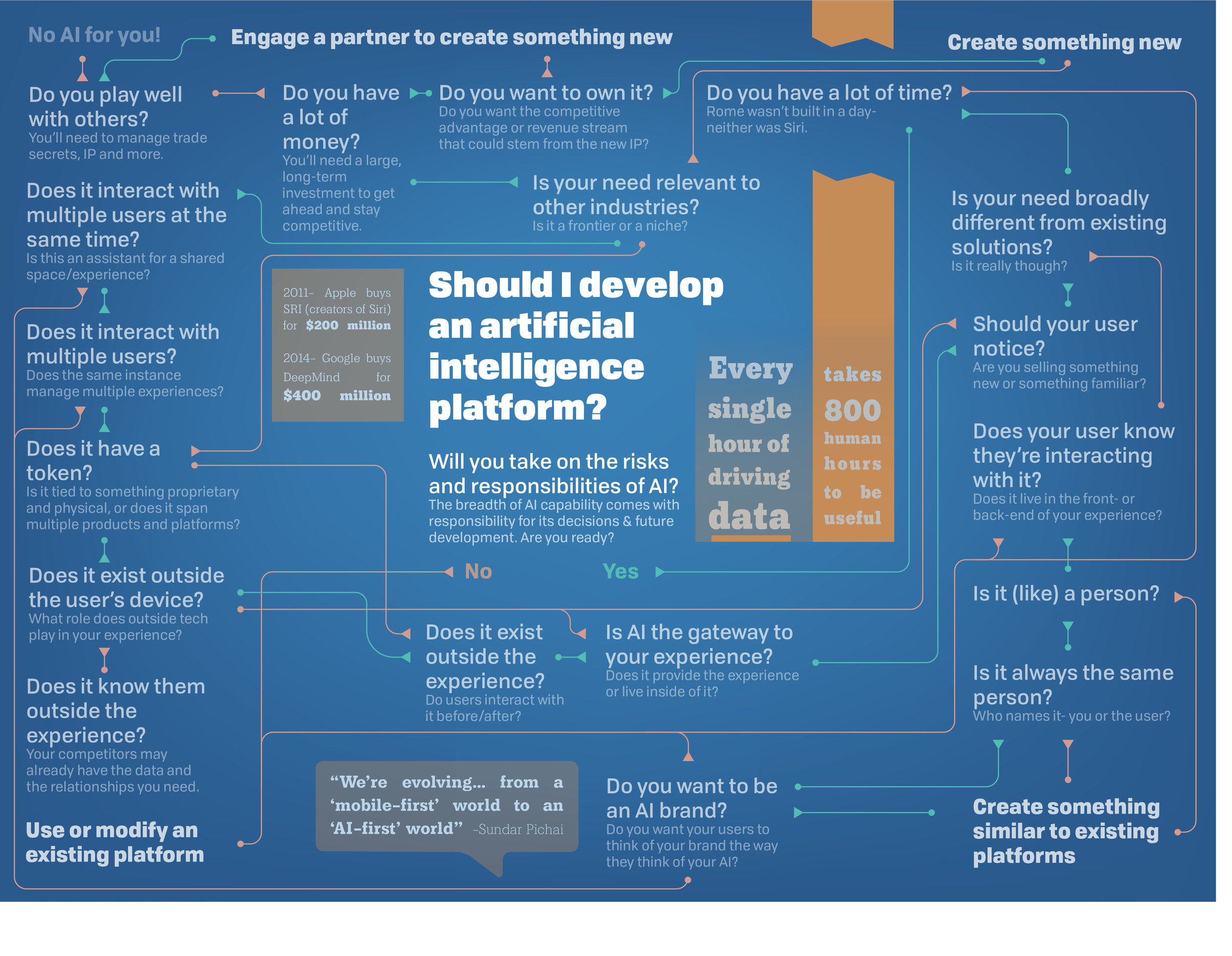
AI is eating the world. What are you doing?
Project: Should I develop an AI?
Team: Gautham Varma
Role: Ideation, brainstorming, visual/logical flow and final graphics
Duration: 3 weeks
Challenge: AI poses massive new challenges for brands and products. How could an organization think through the implications of developing an AI platform on their identity?
Method: Visual sense-making
Result: Infographic and online explainer (take the test!)
This is not a bone.
Or is it?
As lab-based food production increases, will the food we eat look and feel the same? Should it?

Project: Bistro in Vitro
Team: Francesca Barchiesi, Nichon Glerun
Role: Design, production
Duration: 10 weeks
Challenge: Revolutions in the production of food (such as lab-grown meat) present the opportunity for new food cultures and forms as well. How will we eat? Who decides what is natural?
Method: Trend history, speculative design, rapid prototyping
Result: Artefacts for an exhibit staged throughout the Netherlands and at the Deutsches Museum (Munich)
2014 Dutch Design Award recipient, design thinking category
Better sports protection starts at the spine.
The human body provides a near-perfect model for restraining torsional impact.

Project: Halo early testing prototypes
Client: Aexos
Role: Initial prototype design
Duration: 8 weeks
Challenge: How can innovative materials and surfaces amplify the functions of natural movements and touchpoints?
Method: 3D scanning, parametric CAD
Result: First-stage prototypes
Do I have your attention?
Lets talk.


